The final logo live on their website.
Process
Ideation
During initial ideation, the client let me know he was looking for a simple logo with clean lines: think Silicon Valley even though they are in law. When asked if he had thought about color, he indicated that his page layout was blue, and I let him know that that color has some "trustworthy" associations for a lot of people, so we decided to proceed with a blue shade. We settled on a typeface first, and then I created many variations for him to review.
In brainstorming - I thought about LegalWin as a guide for people - helping them navigate the pathway of the legal system. Maps, compasses, etc. are all referenced in the designs below.
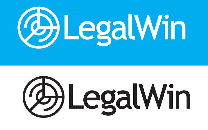
After this first round, the client gave me a bit deeper intel on what he was looking for in terms of the logo symbol itself. His company provides tech solutions for low-income legal clients that wouldn't be able to afford a lawyer. Equality was a big part of that, and he wanted to convey that in the logo. He also asked for some additional exploration with the letter L.
Given that additional direction, I provided some additional options, below.
Round 2 - Equality focus
Of these, the client really liked the second one, and after a few final tweaks we landed on the final logo, below.


